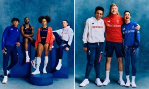
Bland, blue, and designed to avoid any brouhaha – or hoo haa. That is the formula for the official British kit for this summer’s Paris Olympics and Paralympics, which was unveiled in Paris on Wednesday.
According to Adidas, the manufacturer of Team GB’s kit, the athletes will wear “a design DNA that celebrates the unique aspects of Great Britain, while encapsulating the fire of passion that burns within every athlete”.
The company also said that the typeface on the kit was inspired by British athletes in 1924, and – more incredulously – would have “a design element featuring tactile graphics so when athletes run their hands over it, they can feel the passion rising from the typeface”.
Yet the overwhelming reaction on social media was that the kit was just a little dull – although that may not be a bad thing given the culture wars and criticisms that have erupted around sporting attire recently.
And can you blame the British Olympic Committee for playing it safe given the furore around the multicoloured St George’s flag on the collar of the England men’s football kit? Especially when it led to the prime minister, Rishi Sunak, and leader of the opposition, Keir Starmer, voicing their disapproval of the Football Association.
Over Easter the BOA also faced tabloid backlash over the sale of a Team GB flag to fans, with one paper describing it as a “union joke” – as it contained dots and squiggles, as well as pinks and purples, rather than just red, white and blue colours.
The British outfits for Paris flirt with no such controversies. Traditionalists will be particularly heartened by seeing the union jack on the left sleeve of all Team GB tops – although they may be less happy that it is subtle, rather than front and centre of the kit.
There is also no equivalent to the controversial high-cut bikini line on the United States kit, which triggered a wave of criticism last week. As the Olympic long jumper, Tara Davis-Woodhall, put it after seeing a mannequin wearing the US kit: “Wait, my hoo haa is gonna be out.” While it later transpired that it didn’t truly reflect the shape of the outfit, and that US athletes had several other alternatives, Nike executives were pilloried for being sexist and misogynistic.
Perhaps the biggest criticism you could make of the British kit is it is very blue. Bluer than any Team GB kit since the Sydney 2000 Olympics. However, as Katharine Merry, who won a 400m bronze medal at those Games put it: “It’s simple. There is nothing wrong with simple. It reminds me of the Sydney 2000 kit … Classic. Some might say it’s boring … But trust me … There is nothing boring about wearing it!”
